Most dental websites do not lose patients because they look bad.
They lose patients because they make the visitor work too hard.
A new patient does not land on a clinic website in a calm, analytical mood. They are usually doing one of three things: checking whether you treat their issue, deciding whether you feel trustworthy enough to contact, or comparing you against two or three other clinics open in nearby tabs.
That is a fast decision.
If the page does not create clarity quickly, reduce doubt early, and make the next step feel easy, the visitor leaves. No complaint. No enquiry. No appointment. Just another silent exit that gets blamed on “low traffic” or “weak marketing.”
In many cases, the marketing is not the real problem.
The homepage is.
This article breaks down a sample dental homepage audit to show where clinic websites quietly lose booking momentum. Not through obvious mistakes. Through subtle ones. The kind that make a site look acceptable while still underperforming.
And that is what makes them dangerous.
What a patient is actually looking for in the first few seconds
When a new visitor lands on a dental homepage, they are not asking whether the design is modern.
They are scanning for answers to a smaller, more practical set of questions:
- Am I in the right place?
- Do these people seem credible?
- Do they handle the kind of care I may need?
- Does this feel easy to move forward with?
That is the real job of the homepage.
Not to say everything.
Not to impress other marketers.
Not to list every service before trust is built.
Its first job is to make the patient feel oriented, reassured, and ready to take one simple next step.
When that sequence breaks, bookings usually break with it.
The homepage we reviewed
The clinic homepage we reviewed had good raw ingredients.
It looked modern. The core sections were there. The site was not chaotic. There was already an appointment CTA. There were trust elements on the page. Nothing about it felt obviously broken.
But the page still had a conversion problem.
Why?
Because the message sequence was doing less work than it should.
The homepage introduced the clinic, but it did not quickly communicate the patient outcome. It showed proof, but not in the place where doubt was highest. It asked for action, but before enough confidence had been built.
That is a classic conversion leak.
Not dramatic enough to trigger panic.
Just enough to suppress action.
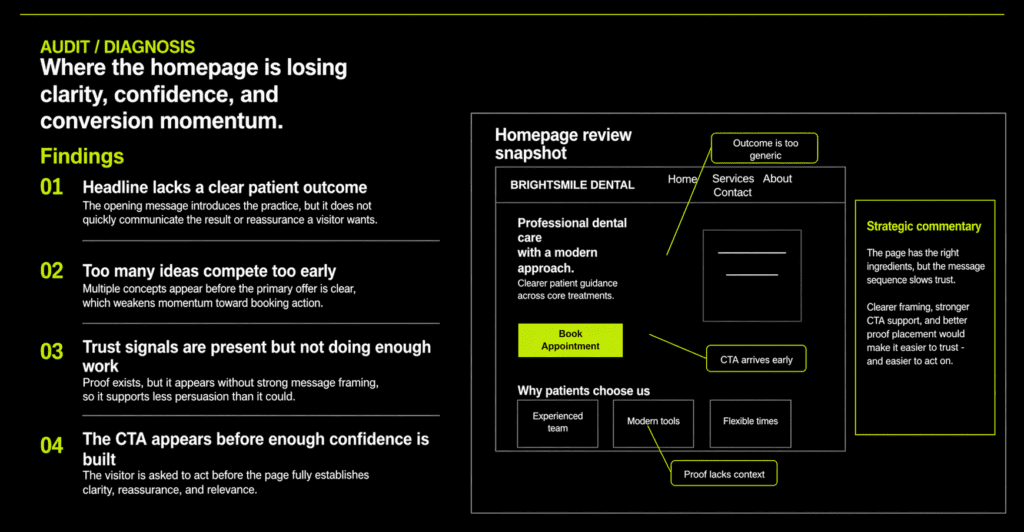
Where the homepage starts losing trust
1. The headline introduces the clinic, not the patient outcome
This is one of the most common problems on dental websites.
The headline sounds competent. Professional. Safe. Reasonable.
But it does not say enough about what the patient gets.
That distinction matters more than most clinics realize.
A homepage headline is not there to announce that your practice exists. It is there to reduce uncertainty. A strong headline helps the patient quickly understand both the value and the emotional tone of what comes next.
Weak dental headlines usually sound like this in spirit:
- professional dental care
- modern treatment
- quality service for every patient
- trusted care with experienced staff
None of those lines are offensive. They are just too broad to do real work.
They describe a clinic from the clinic’s point of view.
A stronger headline frames the promise from the patient’s point of view.
Something closer to this:
Clear, Modern Dental Care That Helps Patients Feel Informed, Comfortable, and Ready to Move Forward
That is not clever copy.
It is strategic copy.
It does three things quickly:
- signals reassurance
- suggests a smoother patient experience
- moves the message closer to a real human decision
That is the difference between a headline that decorates the hero section and one that actually earns attention.
2. Too many ideas compete before the page earns clarity
Another common leak is message crowding near the top of the homepage.
A clinic wants to communicate everything at once:
- modern tools
- caring staff
- flexible appointments
- multiple services
- years of experience
- insurance acceptance
- convenience
- trust
- booking CTA
The intention is understandable.
The result is usually weaker than expected.
When too many ideas arrive too early, the visitor has to do the sorting themselves. That slows momentum. And once momentum slows, doubt grows.
A homepage does not need to hide information. But it does need to control the order.
The top of the page should usually do this:
- Clarify the core promise
- Reinforce it with one supporting line
- Present one clear next step
- Add trust support immediately after
Only then should the page expand into broader service detail, process, or supporting benefits.
Good homepage sequencing feels almost invisible.
The visitor never thinks, “That was well organized.”
They just keep moving.
3. Trust signals exist, but they are not placed where doubt happens
Many clinic websites already contain trust signals.
That is not the issue.
The issue is whether those trust signals are doing useful work at the moment doubt appears.
This is where otherwise decent websites quietly underperform.
A badge in the wrong place, a testimonial too far down the page, a generic “experienced team” line without context, or a service block without enough reassurance — all of that weakens the persuasive effect of proof.
Trust is not just about having evidence.
It is about timing the evidence.
For a new patient, doubt often appears right after the first impression:
- Is this clinic credible?
- Do they feel established?
- Will I be comfortable here?
- Is this going to feel confusing or stressful?
That means proof should show up early and in context.
Not buried.
Not floating without explanation.
Not treated like decoration.
A stronger trust sequence might include:
- a short credibility strip below the hero
- one well-framed patient reassurance statement
- one proof point tied directly to the promise
- one softer secondary CTA for those not ready to book immediately
When proof shows up where hesitation starts, the homepage gets easier to trust.
And when the page feels easier to trust, action becomes easier too.
4. The appointment CTA appears before enough confidence is built
This is the leak many clinics miss.
They technically have the CTA.
But the page asks for the click before it has earned it.
The problem is not the presence of the CTA. Every clinic should have one. The problem is unsupported urgency.
If a patient has not yet understood the offer, felt reassured, or seen enough evidence to feel safe moving forward, a “Book Appointment” button can feel early rather than helpful.
That does not always create visible friction. Sometimes the visitor simply ignores it and keeps scanning. Sometimes they leave. Sometimes they tell themselves they will come back later.
Most do not.
A stronger approach is to support the primary CTA with a lower-friction alternative.
For example:
Primary CTA: Book an Appointment
Secondary CTA: Explore Treatments
That gives different visitors different ways to progress.
Some are ready to act.
Some are still reducing uncertainty.
A good homepage respects both.
What the patient is thinking, even if they never say it
One of the most useful ways to audit a clinic homepage is to stop reading it like an owner and start reading it like a cautious first-time patient.
That inner dialogue is usually simple:
- Do they handle what I need?
- Do I trust them yet?
- Will this feel easy?
- Is there any reason not to contact them?
If the page does not answer those questions fast enough, the visitor starts drifting.
This is why many clinics mistake homepage underperformance for a traffic problem.
Traffic is not always the leak.
Interpretation is.
How we would rewrite the hero section first
Let’s take the kind of broad messaging many clinic sites use and sharpen it.
Current direction
Professional dental care with a modern approach and quality service for every patient.
Stronger direction
Trusted Dental Care With Clear Guidance, Modern Treatment, and a Smoother Patient Experience
From routine checkups to cosmetic and restorative care, we help patients feel informed, comfortable, and confident about what comes next.
Primary CTA: Book an Appointment
Secondary CTA: Explore Treatments
Why is this stronger?
Because it stops trying to sound polished and starts trying to reduce hesitation.
The improved version gives the visitor:
- emotional reassurance
- treatment breadth
- process clarity
- a clearer reason to continue
That is what good conversion copy does. It removes friction before it sells.
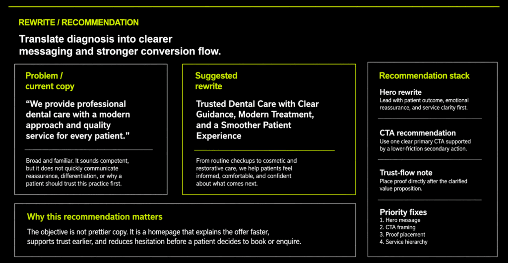
The fix order that matters most
If this were a real implementation project, I would not start by redesigning the whole site.
I would fix the highest-leverage conversion elements first.
Priority 1: Hero message
The page needs a clearer patient-outcome promise at the top.
Priority 2: CTA framing
The action needs better support and, ideally, a softer secondary path.
Priority 3: Proof placement
Trust signals should appear earlier and closer to moments of hesitation.
Priority 4: Service hierarchy
The page should introduce treatment categories in a cleaner, more digestible order.
That order matters.
A lot of clinics waste time redesigning lower-value sections before fixing the message sequence that controls first impressions.
Why this page is more useful than another generic “dental marketing tips” article
Broad advice is easy to publish and easy to ignore.
Specific teardowns are different.
They show what good diagnosis looks like. They make invisible friction visible. They give a clinic owner something more useful than motivation: they give them a lens.
That is also why this kind of page has more long-term value.
A vague article can attract a few visits and disappear.
A sharp audit example can do more:
- rank for a clearer problem
- earn trust faster
- support sales conversations
- act as proof of strategic capability
If you have already read why most business websites don’t convert, this is the dental-specific version of the same truth: websites usually underperform because the message sequence breaks before the visitor ever reaches the form.
And if you are thinking about visibility more broadly, our small-business guide to ranking in Google AI Overviews explains why specific, well-structured pages tend to outperform generic content blocks.
The wider lesson for dental clinics
A patient does not need your homepage to say everything.
They need it to say the right things in the right order.
That is the real difference between a clinic website that feels fine and one that consistently turns attention into enquiries.
The strongest clinic homepages usually do four things well:
- they clarify the offer quickly
- they build trust before demanding action
- they reduce emotional hesitation, not just informational confusion
- they make the next step feel obvious
When those four things are missing, the clinic often compensates with more ads, more posting, more marketing.
Sometimes the smarter move is simpler.
Fix the page that traffic is already landing on.
Final thought
If your website is getting visitors but not enough appointments, do not assume the problem starts with lead generation.
Sometimes the leak is already on the homepage.
Sometimes the page is saying enough to look credible, but not enough to make action feel safe.
And that gap is where a lot of new patients disappear.
Want a second set of eyes on your clinic homepage?
If you want a sharper view of where your website is losing trust, clarity, and booking momentum, contact us for a homepage conversion audit.
We will show you:
- where the message gets vague
- where trust arrives too late
- where the CTA is unsupported
- what to fix first before you spend more on traffic
No inflated jargon. No decorative marketing advice. Just a clear diagnosis, a smarter message sequence, and a practical fix order.